"Line and Surface" by Vilém Flusser
I made 2 series of sketches by 2 interesting points i found.
Sketch One (Black & White)
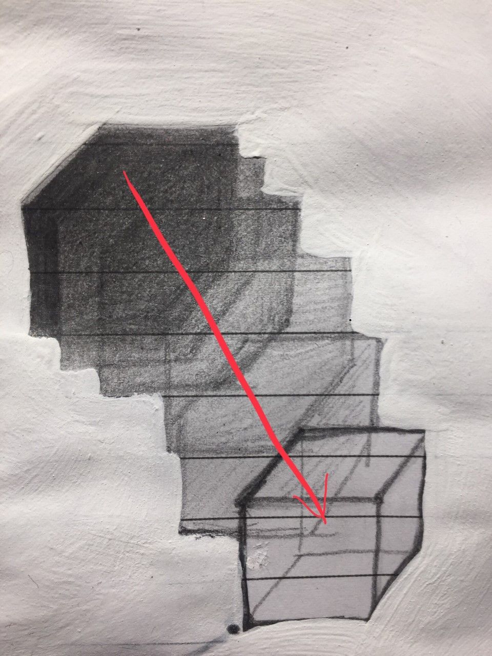
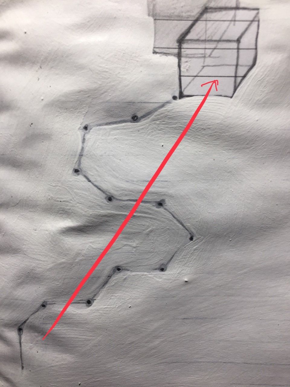
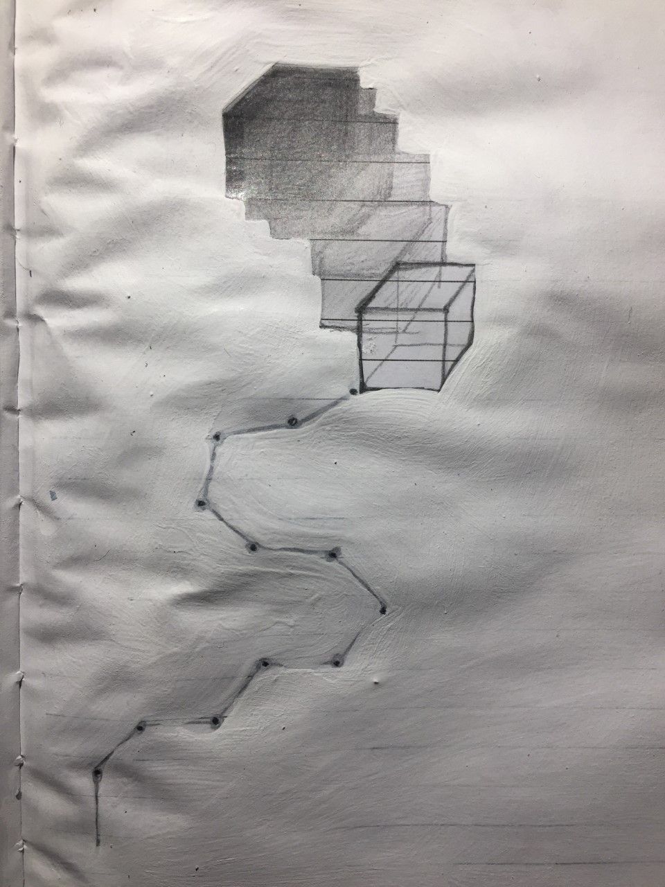
what inspired me was, the difference between the processing of the picture-perception (SURFACE) and the text-perception (LINE). As the text has been mentioned (here i use my way of saying it), the 1D text has its own constructure and direction in a linear way of thinking so the audiences need to pass through this path - to get the entire expression. However, the pictures are 2D images with the whole entire expression already out when you look at it from the 1st moment, but then it makes you analyze what's underneath the surface, then you back to your own thoughts from the picture itself. Based on this difference, i made an analogy: the cube symbolize the goal/result/entire-core of both perceptions (surface/picture and line/text), the perception of the surface started with a 2Dshadow of the cube, the shadow moves, slowly "realized" the oringin/"soul" of itself is this cube; the perfception of the line started with a spot, there is 12 lines (you need 12lines to outline a cube) on the path, then it gets to the final shape - the cube! There is first 2 pictures to explain what i have been said above. On my 3rd picture, as the full version original sketch, it presents the perception of both meet together.
Sketch Two (Color)
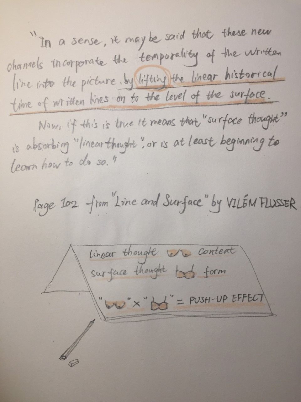
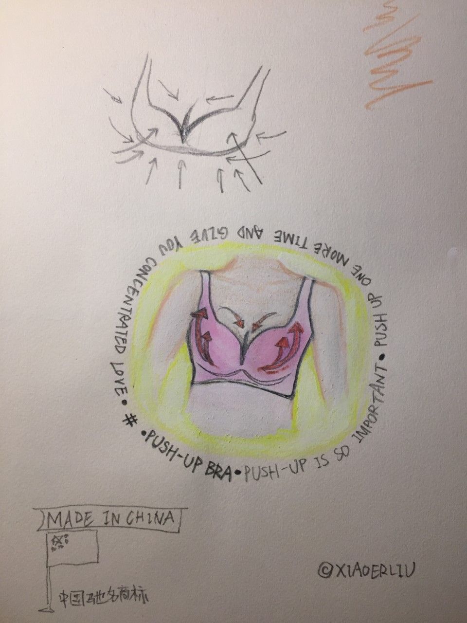
This one is a bit funnier. It is purely imaginal based. It contains 2 pictures. The 1st is the part of the text, where it triggered me. The 2nd is the result of the trigger. Ridiculous feminine feminism FATASY.
